Machine learning quality report
When you refine results with machine learning, Mascot automatically assesses the quality of the result. The machine learning quality report provides several graphical plots that summarise important metrics about rescoring performance. It helps answer questions such as:
- Did machine learning improve my results? If so, how much?
- Did I choose the correct model for my data?
- Are the retention time predictions (DeepLC) or spectral correlations (MS2PIP) accurate?
- Which features contribute most to the separation between target and decoy matches?
The machine learning quality report is built on reports and functionality provided by MS2Rescore, which is included as part of Mascot Server. We are grateful for the effort put in by the CompOmics team at the University of Ghent to design the graphical plots, which are included in Mascot by permission.
Report basics
The machine learning quality report is always available when you refine results with machine learning. The link to the report is below the Sensitivity and FDR section in the Protein Family Summary report.
The report header states the date the report was generated as well as the versions of Mascot Server and MS2Rescore. The main body is divided into three tabs as described below.
All the plots are interactive graphics powered by the plotly library. Click on the graph area to zoom or pan, and click on the icons in the top right area to save the plot as an image (PNG), zoom in/out and reset zoom.
The HTML file can be saved by opening it in a web browser, then saving as a file, but it may be very large (dozens of megabytes) for large searches.
Overview tab
General statistics
On the overview tab, the general statistics section has two important comparisons: the number of peptide-spectrum matches (PSMs) before and after rescoring, and the number of peptides before and after rescoring. If rescoring did not improve your results, the counts before and after rescoring will be very similar, so this is a useful first sanity check.
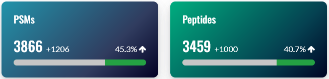
Note: The exact number of PSMs and peptides gained differs slightly between the counts reported in the Sensitivity and FDR section of Protein Family Summary, and the machine learning quality report. There are two reasons. 1) Mascot counts unique sequences, while MS2Rescore counts unique peptides (sequence + modifications). 2) MS2Rescore uses slightly different rules concerning matches whose score is exactly at the score threshold, so usually reports a few percent more PSMs and peptides than Mascot. We will look into resolving this discrepancy in a future release of Mascot.
Score comparison
On the overview tab, the score comparison plots PSMs on two axes: before and after rescoring. The ‘before’ score is -10*log10(E), where E is the expect value of the match. Note, this is equivalent to the p-value corrected for multiple testing (not the Mascot ions score). Mascot determines statistical significance by comparing the expect value to the significance threshold, so this provides the most direct comparison with the ‘after’ score.
The ‘after’ score is -10*log10(PEP), where PEP is the posterior error probability of the match as estimated by Percolator. When rescoring is enabled, Mascot reports the PEP as the expect value of the match, so this provides the most direct comparison with the ‘before’ score.
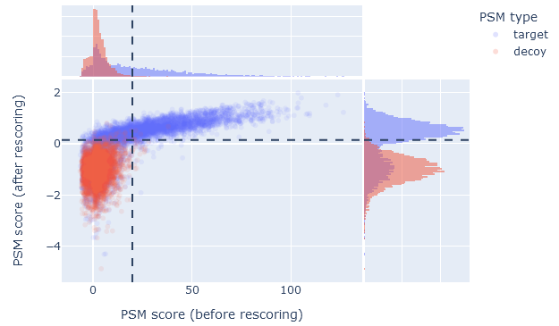
When machine learning has improved the results, the score comparison plot should show a wide scatter towards the upper part of the graph. In the upper left segment, plotted in blue colour, are the PSMs that became significant after rescoring. If there are few or no PSMs in the upper left segment, then machine learning made little difference to the number of identifications.
The upper right segments shows PSMs that are significant both before and after rescoring. If this segment is mostly empty, then high-scoring database matches have been demoted into false positives. Typically, high-scoring Mascot matches remaing high scoring and significant after rescoring, so there is typically a wide scatter in the upper right segment.
The dashed lines indicate 1% PSM FDR as estimated from the decoy matches. The 1% sequence FDR may correspond to a stricter threshold, depending on the extent of duplicate PSMs.
False discovery rate comparison
On the overview tab, the false discovery rate comparison is a quick way to assess the effect of rescoring on sensitivity (number of ‘correct’ matches among all positive matches). It shows the number of identified PSMs in the target database (vertical axis) as a function of the estimated FDR (horizontal axis). The dashed line is 1% PSM FDR.
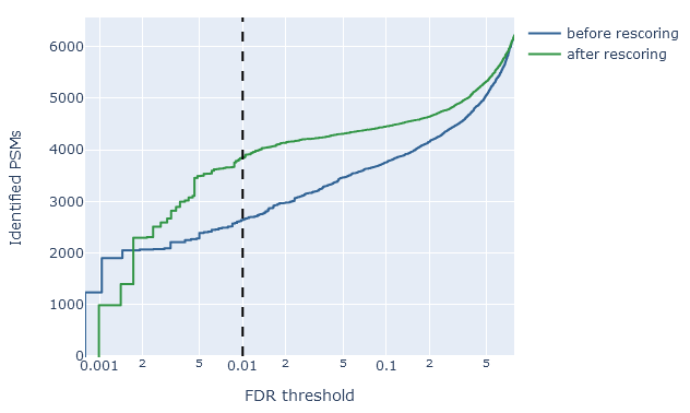
For example, if rescoring improved the sensitivity at 1% PSM FDR, the green line (after rescoring) should show a higher count than the blue line (before rescoring). An optimal scenario is when the the count of rescored PSMs stays relatively high even at very low estimated FDR. This means you are able to apply a very strict threshold, get a very low FDR and still retain a good number of matches.
If rescoring did not improve results, or made the results worse, the green line will be about the same (or even below) the blue line.
Identification overlap
On the overview tab, the identification overlap displays a simple graphical summary of the number of PSMs gained and lost, and number of peptides gained and lost. Ideally, rescoring should always increase the number of matches. It is natural for some matches to be lost, because the results before rescoring (the ‘raw’ search engine results) always contain false positives. One of the jobs of refining results with machine learning is to detect and throw away the false positives.
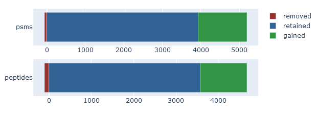
If rescoring did not improve the results, then the identification overlap will show very few mathes gained. If rescoring made things worse, the graph should show a large number of matches lost and nothing gained.
Target-decoy evaluation tab
Score histogram
On the target-decoy evaluation tab, the score histogram visualises the score distribution of target PSMs (blue) and decoy PSMs (red) after rescoring. The two distributions always overlap, because the matches in the target database are a mixture of correct and incorrect identifications. Matches in the decoy database are always incorrect matches. If there is little separation between targets and decoys, the blue and red distributions are almost the same.
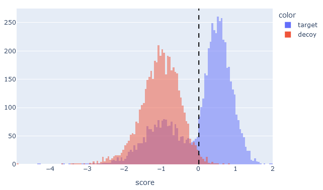
If machine learning has greatly improved separation between target and decoy matches, then the target PSM distribution (blue) should be bimodal with two clear peaks. There should be a peak to the left of the 1% PSM FDR line, which are the incorrect matches in the target database, and a peak to the right of the line for correct matches. The decoy PSMs (red) should always have a single peak to the left of the 1% PSM FDR line.
If there is little obvious separation between the target and decoy distributions, or if the target PSMs are ‘smeared’ into a wide single peak, then machine learning did not manage to improve the matches.
Percentile-percentile plot
On the target-decoy evaluation tab, the percentile-percentile (PP) plot visualises the quality of decoy matches. That is, are the decoy PSMs a suitable model for incorrect target PSMs. There are two things to check.
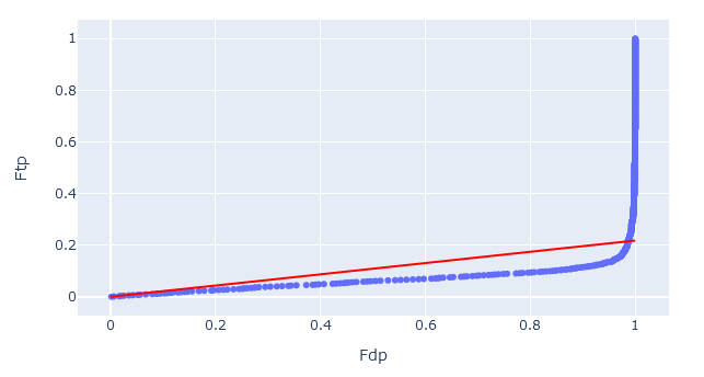
1. Straight vs curved line. If two statistical distributions are the same, the PP-plot forms a straight diagonal line. Assuming the target sequence database has been chosen well, the line should curve at the very end (towards FDP = 1.0) as these are the correct matches in the target database.
If the PP-plot is curved anywhere else, it indicates that the decoy PSMs are behaving differently from incorrect target matches. In this case, the decoy matches are not providing a good simulation of incorrect target matches, and the estimated false discovery rate may be lower than the ‘true’ FDR.
2. Slope of the line. The red diagonal line is the estimated fraction of incorrect PSMs (𝜋0). Ideally, the PP-plot should follow the red diagonal line exactly.
If the PP-plot is below the diagonal line, then there are fewer decoy matches than expected. This could be caused by too narrow precursor tolerance, especially with high accuracy instruments. If the PP-plot is above the diagonal line, then the opposite is true and there is an issue with the choice of the target database.
Rescoring features tab
Individual feature performance
On the rescoring features tab, the individual feature performance is displayed as a bar chart. The features displayed are the ones that were used in rescoring.
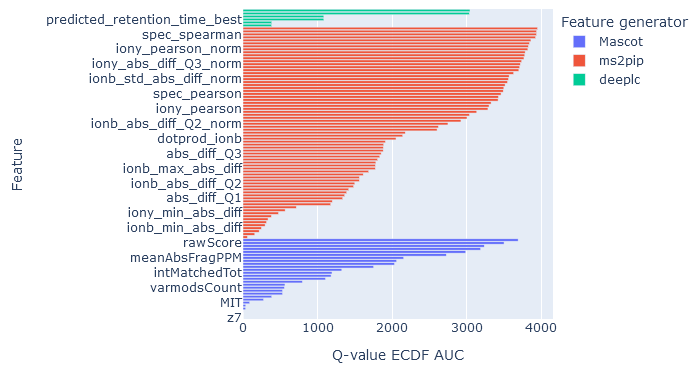
Core features calculated by Mascot are always shown.
DeepLC features are shown if you have selected a DeepLC model for predicting retention times. MS2PIP features if you have selected an MS2PIP model for predicted fragmentation spectra. In both cases, more than one metric is calculated from the difference between observed and predicted properties of the peptide. For example, MS2PIP calculates a selection of correlation metrics for difference in b fragment intensities, y fragment intensities and all fragment intensities.
The horizontal axis measures the q-value empirical cumulative distribution function (ECDF) area under the curve (AUC). The higher the AUC, the better that feature is at discriminating between target and decoy matches. Features are assessed independently as if it were the only feature used in rescoring.
If the AUC of features from a feature generator (DeepLC, MS2PIP) are very low, it means those features are poor at separating target and decoy matches. One possibility is that the wrong prediction model has been chosen. Another possibility with retention time predictions is that the observed retention times do not span a sufficient width for DeepLC calibration. For example, most DeepLC models have been trained on 60 min or 120 min gradients. If you are using very short elutions, like 5 min or 10 min, or you have searched a short RT slice, then DeepLC calibration may fail and the predicted retention times provide poor discrimination.
MS2PIP model performance
On the rescoring features tab, MS2PIP model performance is shown in graphical form if you have selected an MS2PIP model. The histogram shows the Pearson correlation between predicted and observed fragments (this is the spec_pearson_norm feature). Decoy peptides, and non-significant target peptides at 1% FDR, are excluded.
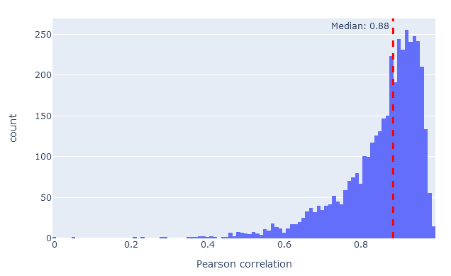
If model performance is very poor, the correlations will typically form a peak around zero, indicating no correlation whatsoever. The closer the histogram is to correlation 1.0, the better the model performance. In most real-life data sets, median correlation above 0.85 indicates good model performance.
DeepLC model performance
On the rescoring features tab, DeepLC model performance is shown in graphical form if you have selected a DeepLC model. There are two graphs.
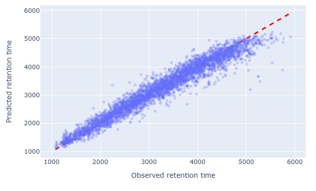
The scatterplot shows the observed retention time compared to predicted retention time. Any value on the diagonal line is a perfect prediction. Decoy peptides, and non-significant target peptides at 1% FDR, are excluded.
When the model has been chosen well, and RT calibration has succeeded, there should be very little scatter; the values should closely follow the diagonal line. If the wrong model has been chosen, or there are not enough good quality PSMs to successfully calibrate the predictions, the scatter will deviate from the diagonal line. There are always outliers (e.g. high predicted RT compared to low observed RT). What matters is that there should be relatively few outliers.
The histogram below the scatterplot shows the relative mean absolute error (RMAE) of benchmarking data sets used to evaluate DeepLC. The red dashed line shows the RMAE for the current data sets. Decoy peptides, and non-significant target peptides at 1% FDR, are excluded from RMAE calculation. The smaller the RMAE, the better the predictions, on average.
However, it is possible for RMAE to be very small even when the predictions are random, so a small RMAE does not necessarily mean the model is performing well. For example, if you take a 5 minute slice from a 120 min elution, say 63 min to 68 min, then DeepLC will attempt to calibrate all predicted values to the 5-minute ‘observed’ range. The maximum absolute error will small (<5 min), and the predictions may be quite randomly scattered in the interval. The RMAE may be small, say 4%, even though most of the predictions will be wrong. In this case, the scatterplot will reveal the underlying issue.
